Sunday, 26 August 2012

Final 2d Animation

I used the green colours at the beginning of the animation while the young carer was talking about the difficult times when being a carer because its not a friendly colour or one that envokes the thought of happiness. I also added the mist to show it was unclear subject with many different opinions and feelings. I thinks that I have really thought about what I water the audience to feel.

The tree on its own is meant to show how isolated and alone a young carer can feel when they have no support and noone to help.
I didn't want to detract from the story that the young carer was talking about so I decided not to overbear the animation and chose to animate subtlety. I wanted to enhance the story not detract from it. I think that I have managed to accomplish this well.

I used the falling leaves and the grass blowing in the wind as subtle movements to show that everything isn't always harsh and hard things can be pushed through. I also wanted to create an obvious contrast between the dialogue talking about being a carer and the help that he gets. I think that I have created a different feeling. The blue colours are to create mystery but I think that blue doesn't necessary create the warm feeling that I was trying to portray and if I dis it again I would probably create a more warm colour like orange or pinks and reds.

The end of the animation show that young carers aren't alone and they do have was of getting support. I think that this message is very clear and I overall accomplished the message I wanted people to see.

Messy Files

I have learnt a lot of things about how to manage my files in Maya. I have tried to keep them clear and tidy but because I wanted to update and backup my work the files started to build up. I wanted to reduce the files and start tto clean them up when I changed a file name and it became unreadable. So I in the future I will name the files and make them tidy as I go. out

Tuesday, 7 August 2012

3D Water Simulation


After completing my character and the modelling texturing and animation of the street scene I wanted to look at more animation movement. I decided to create a basic water animation to show animation flow and other aspects that I have learnt.

I think that this animation shows the movement of water well but perhaps not the way that gravity acts on it very well. The water seems to be quite floaty and it does bounce out of the basin too far. The direction of flow though I think I have accomplished. To improve this I could add some colouring and texturing. Also the lighting would add to the overall asthetics of the animation.

I think I have expanded my knowlege of the program and show that in this example. There is a lot too learn and

Thursday, 19 July 2012

Modeling a Lamp

The lamp has showed my how to model and texture well and has given me the skills to go on and experiment with the program. The house that I have created has also expanded what I know. I think that I have done well with the model and the texturing although there have been a couple of things that of gone wrong such as. I had trouble with the model and some of the extruding but I fixed it and was able to troubleshoot well. Because it was a tutorial to show the software it's difficult to comment on it in a reflective way. I found it neither easy or hard to follow and believe that I did well with following the instructions. To create something that I can look back at and use for reference in the future.

Tuesday, 17 July 2012

Lip Sync


This is the Lipsync that i created from a short clip from young carer interview. I first used the sound file to determine where to place the mouth movements. I think that the range of movements that I have used cover the shapes of the mouth through speech to a detailed standard. I used several different pieces of reference material to create a set of mouth positions that would compliment my character and the style of speech.

I think that the movement that has been made inbetween the main keyframes could be smoother so to improve it I would add in halfway frames to show the transition through speech more smoothly. I think that I have draw mouth shapes that match the speech action very well and they show the tounge and teeth realistically.

I created the faces attached to the mouth shapes in Photoshop and have used this method so I could have something that looked like it should be there and that the mouth matched the face. 

Saturday, 14 July 2012

Final animation colour concepts

These are the color pallettes I have decided to use for the final carers animation. The green dark colours are to show the difficulty and loneliness of being a young carer. The colours are quite monchrome and i have done this so you don't lose the raw emotion from the young carers dialog and the mood that I am trying to create. The vibes that people get from the colours I have chosen are unhappy.

Tuesday, 10 July 2012

Walk Cycle

I have looked at basic walk cycles to create one of my own for my angel character. Although I have also create a wing cycle I know the character is not always going to fly. The first walk cycle I made was not what I wanted and did not represent my character. I believe that I got the movement keyframes right but I tried to add too much detail and lost out on the belivablity of the movement. It's also too rushed. 


I then had a look at experimenting with different angles and shapes to create a more basic form that shows the movement to it's best advantage so it looks natural. I have experimented with walking straight on to the camera below. I think that it shows good movement and is a vast improvement on the walk cycle above even though its a different angle. It show the side to side movement that occurs due to the change in height of he hips as each foot is placed. 

Final Animation Storyboard

The storyboard I have made I think shows the preliminary animation well with movement and detailed explinations of what I planned to do. I was hoping to create the animation exactly as I showed in the storyboard but it doesn't always work that way. I think that I could improve my work if I could have created another storyboard throughout the process I would have been able to create something more true to the original. I think that I have learnt from my animating process that I need to be more realistic with the goals I set myself because of time and my abilities foe detailed Photoshop work.

Friday, 6 July 2012

Syncing image to music


Syncing image to music is quite difficult and this was my first attemp at such an exercise. I think I have done quite well in expressing the music through movement and shapes. Although I went through the presise times and made a note of them i found it difficult to presisly match the sound to the different instruments in the music.

I have used different colours and different shapes to represent the different instruments and the pitch that they make. I think that this was an important part of the animation to give variation to the instruments needed.

Final Walk Cycle

I have looked at many different ways of walking and tried to create something that reflects the personality of my character. I have struggled greatly with drawing a profile of my character that shows the walk cycle and movement.

I have used basic shapes so it doen't detract from the movement and the viewer can see the personality of the character. I have made sure that the feet bend to show the arc in the foot so the walk doesn't look ridged and make it look stiff.

I think that I have created a walk that looks natural but I think i could of again added more frames to smooth out the movement. I could have also added some more bounce to show the extention of the legs and give a more believeable weight and force to the character.


Wing Cycle

This is the wing cycle that I did for my character I wanted to do something different that linked directly with my characters persona. I created this using sketches, then i scanned them into the computer and used Premier Pro to create the video.

I have had a lot of trouble with knowing and identifying what keyframes I would need. It took me a long time to figure it out because i wanted a smooth movement that showed the graceful nature of angels. I looked at different bird winged motion and found out what keyframes I would need.

I think that I have done a good job at creating a considered animation with detail in the timing and movement. I could improve this by adding more frames in between each of the keyframes and using colours to give a more pleasing feeling.

Wednesday, 16 May 2012

Rotoscoping experimentation


These are the rotoscoping experimentation i have done. The top photo is created in Illustrator using the pen tool to create block black lines. I then fill them in with color, and use the smooth tool to create the curved edge, if this is not done then it creates a jagged line. Although this is an interesting effect it's not what I wanted to create as water is smooth and i wanted to keep that element.


I like the way that the water look ascetically in the top photograph it's different and has it's own character. I do like the way in which the model has been drawn in the top photograph but i think color would improve it as the white block doesn't look right against the background.


The bottom picture is create by using the paintbrush tool in Photoshop i also like this way of drawing a rotoscoped picture, however i don't think it looks as 'clean' or professional. The extra color detail makes it look more realistic in that aspect though. I also used a different rotoscoping technique on the sea turtle. I used a blending brush to create block colors from a source photograph I had taken on a trip to the aquarium. I then used the smudge tool to blend the colors together to create a smooth finish and soft lighting just like under water.  

Water droplets

I have researched into a couple of different ways to create photographs of water droplets and have found the following sites...


http://www.liquidsculpture.com/the_process.htm


http://digital-photography-school.com/forum/how-i-took/10164-patterned-water-drop-shots.html

I am going to experiment with this and see what happens.

Martin Waugh

Martin Waugh
Martin Waugh


I really like this photograph and how simple it is to create. The image is unique and just shows what water can do. I like the harsh ripples and the point where the drops have touched the water. The dark background also highlights the water in the foreground.


I like the way that the light hits the water, and that every picture is going to be different. I am going to experiment with this to see what effects I can create, I think this would be an interesting concept.

Clark Little

Clark Little

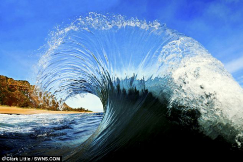
I really like this picture because of the movement and the texture of the water. It creates a fantastic subject matter and makes a simple wave interesting and dynamic. The movement in this picture makes the viewer look from right to left, from the beginning of the wave just starting to break.


I like the way that you can see through the wave and there are different stages of colour from the deep 'unknown' water to very transparent water at the top. The wave looks like glass and is almost like an illusion.


I like the individual droplets at the top of the wave that create something completely unique. I think that it would be interesting to get a photograph like this to add illustrations and possibly rotoscope it to create a completely new effect.


I like the composition because the wave is the main subject starting from the right, i think that having the land on the left adds some colour and doesn't make the photograph wash out as just blue, because of the sky and the sea.

Michel Rajkovic

Michel Rajkovic


This is a photograph that is completely different from anything that I have looked at before. I really like the simplicity of it and that the water doesn't look like water and there is a calmness and a serenity about it. 


I really like that it is black and white, because the tones are very important. I like the almost foam like water and the different tones showing the movement of the water even though it's a still shot. There are different points of interest in this photograph the rock in the foreground is very interesting and creates different shapes and tones of water.


The photograph has a lot of depth even though there isn't much colour. The foreground element then goes back to a large mid element on the right to a distant one on the left. This makes the eye follow back and stops the picture from being flat. 


From this photograph I am going to experiment with black and white to create a different look to a picture and bring more focus to it.  

Stephen Frink


Stephen Frink


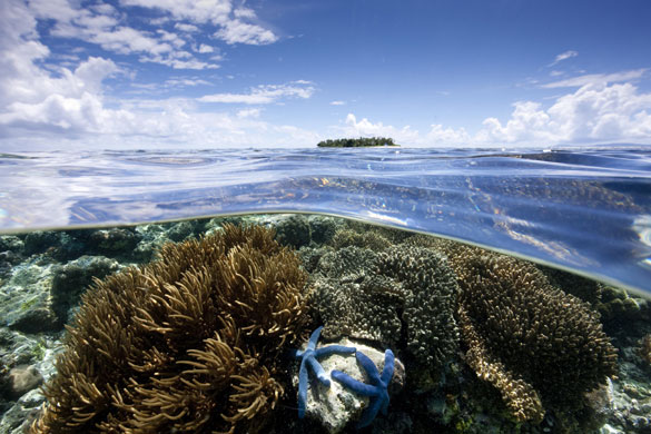
I have looked at more photographers for half in half out concepts. The pictures above shows the same concept but slightly different than the others I have looked at.


On the top picture the subject matter is more open, and I like that there are lots of things to look at in the picture, the main focal point is the small island in the distance as it's the only thing above the water line. 


The reason why I like the half in half out concept is because of the mystery and the difference under the water in comparison to above it. I like the contrast in the top photograph because only one small island above and a completely different populated world below. The sea line almost looks like a film of glass laid on top of the water.


The second photograph is a little different and is more about the shape of the sea line, is an interesting flow and the eye follows it along. The model goes against the sea line which create some interesting shapes and it distorts the angles.


Another interesting part of this is the shadows on the models body, it creates and interesting pattern because of the water above. I'm going to see if I can create something like this in my own work. 


The composition of both photographs are interesting and there are multiple things to look at that create an interest point.


Nigel Barker


Nigel Barker


This image was shot using the half in half out method. I really like the concept that something is hidden under the water, it creates mystery and is individually able to be interpreted. I also like the strong reflection in the water and I do want to create something like this in the photographs I take.


I like the use of a dark background because your eye goes straight to the subject matter in the picture. The reflection is one of the main aspects in the photograph is doubled because of the water, this creates a point of interest.

I am going to experiment with this concept and try to create my own spin on it without using a model. I like this lighting in the photograph and it overall adds to the mystery effect, the water is very still so it looks very glass like. The smoke behind the model creates an infinite background .


I composition is set out very well the focal point is in the centre of the screen but there is interesting subject matter in the background and the reflection, so the picture isn't flat and a depth has been create for the viewers eye to be drawn through.


This picture will be a main focus in my beach and pool sessions as i want to experiment with half in half out.